PRINCIPLES OF FLORAL DESIGN
(Naomi Bjerk, diyblooms.com/principles-of-floral-design)
The principles and elements of design guide both artists and judges in creating and analyzing floral artworks. Principles are abstract guidelines directing an overall floral design while Elements are physical characteristics of plant material.
The 10 floral design Principles include Balance, Stability, Proportion, Scale, Orientation, Rhythm, Dominance, Contrast, Focal Point, and Visual Weight.
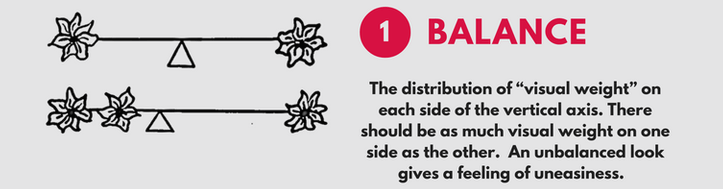
Balance refers to the distribution of plant material on each side of a vertical axis. There are three primary categories of balance, symmetrical, asymmetrical, and open. In symmetrically balanced designs both sides of the arrangement have the same quantity and distribution of plant materials, like a mirror. Asymmetrical designs are complex and composed of an unequal distribution of material but are still balanced because they counter quantity of plant material on one side with other aspects of design on the other—such as motion, contrast, space. One can think of asymmetrical design like a see-saw with a heavy person on one side and two lighter people on the other. We can also achieve asymmetry on the see-saw with a heavy person on one side close to the center and a lighter person on the other sitting way out at the end, far from the center. The third category of balance is Open design which highlights the empty space between floral groupings. An example of this is an arrangement whose leaves or stems are manipulated to form a circle, ball, or parallel lines.
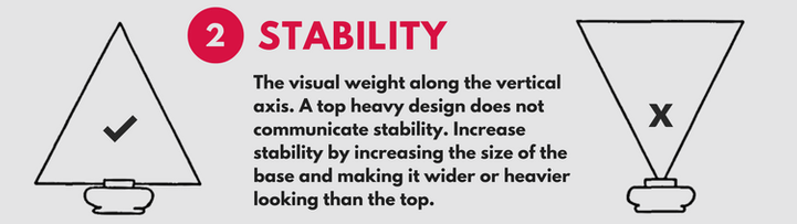
Stability describes the security of an arrangement—how likely it is not for fall over. Designs have both physical and perceived stability defined by the weight and distribution of plant material in an arrangement. Top-heavy designs appear unstable and can be remedied by increasing the width of the arrangement’s base and the density of plant material there at the bottom.
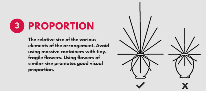
Proportion refers to the size relationship between the elements—such as the length and diameter of the flowers relative to the dimensions of the container. Floral designers avoid using large, heavy containers with tiny, fragile flowers.
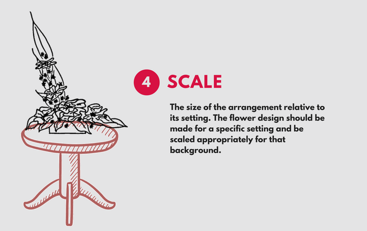
Scale refers to the relationship between the arrangement and its physical location. Designers here at Florescence plan their arrangements knowing the eventual setting for their work—such as on a 40” pedestal in a gallery with 25’ ceilings.
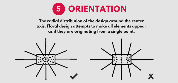
Orientation defines the radial distribution of the design around the center axis. Floral design attempts to make all elements appear as if they originate from a single point.
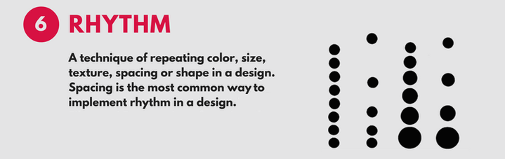
Rhythm refers to the visual movement through the design—this is the path your eye travels from the focal point, out to the edges, and back again. Rhythm is achieved by repeating color, size, texture, spacing, or shape.
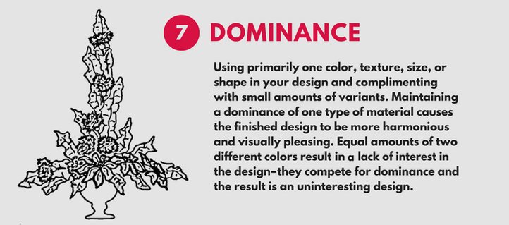
Dominance is the observed importance of one element over another. Using primarily a single color, texture, size, or shape, and complimenting with small amounts of other material, allows a floral arrangement to communicate one importance idea or message instead of several. Equal amounts of two different colors trigger competition and disharmony, while Dominance causes the finished design to be harmonious and visually pleasing.
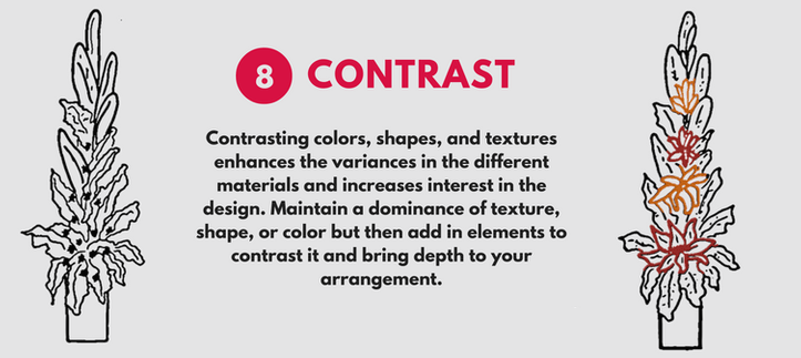
Contrast highlights the differences between colors, shapes, and textures in an arrangement. While maintaining the dominance of one element, designers add smaller amounts of contrasting plant material to bring depth into their work. In other words, a viewer can more easily interpret the attributes of a dominant element by also observing the features of an opposite specimen. For example, large white fragrant roses are easily appreciated when arranged with small delicate lilies of the valley.
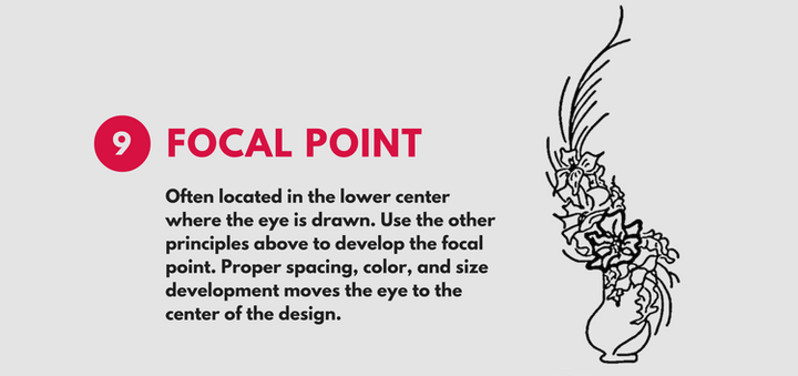
Focal Point is the primary location in the arrangement where the viewer’s eye is drawn. It is often located in the center of the design near the rim of the container. Proper spacing, color, and size invite the viewer’s eyes to move around the arrangement before settling back on the focal point. Secondary points of interest, known as accents, can add great interest to an arrangement but the designer must be sure not to over due this as too many focal points can cause confusion.
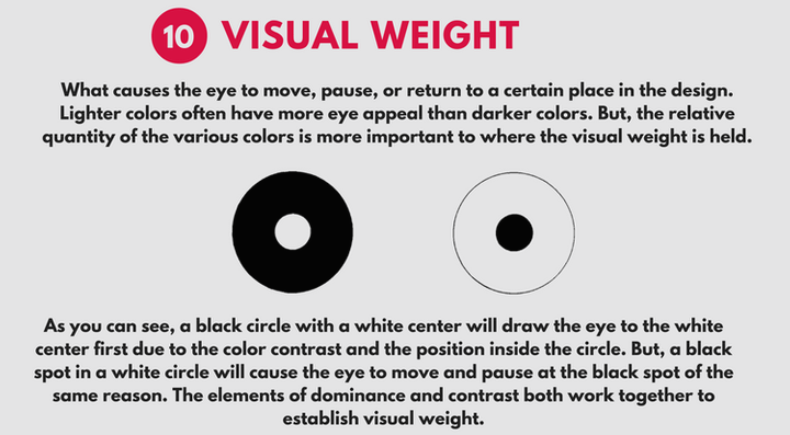
Visual Weight refers to perceived densities of plant material that create a path around an arrangement. Designers carefully place this weight in order to persuade the viewer’s eyes to move, pause, and return to a certain place in the arrangement. Lighter colors often have more eye appeal than darker colors. But the relative quantity of the various colors defines the eye’s path.